
INTRODUCTION
Nature is an endless source of colour, beauty, patterns, shapes, textures, and inspiration. From the green leaves of trees and colourful flowers to the blue sky, flowing rivers, mountains, birds, and animals, the natural world presents us with a wonderful variety of visual experiences. Artists carefully observe these elements and use them as inspiration for creating paintings, drawings, crafts, designs, and other forms of visual art.
The colours of nature change with light, weather, seasons, and time of day. A sunrise may fill the sky with warm shades of yellow, orange, and red, while an evening sky may display soft pink, purple, and blue. Leaves may appear in different shades of green, and flowers may show a wide range of colours and tones. Observing these changes helps artists understand how colours work together and how they can create different moods and feelings.
Nature also provides artists with interesting lines, forms, patterns, and textures. The veins of a leaf, the spiral of a shell, the patterns on a butterfly’s wings, the texture of tree bark, and the shapes of clouds can all become ideas for artistic expression. Traditional Indian artists have long drawn inspiration from plants, animals, birds, landscapes, and natural surroundings.
Exploring nature’s palette encourages us to look closely, observe carefully, experiment with colours, and appreciate the beauty around us. It teaches us that art can begin with something as simple as noticing a colour, shape, or pattern in our surroundings.
Body
Nature showers us with colour every day. A rainbow displays the entire range of colours the human eye can see.
Nature has always been an important source of colour, inspiration, and creativity for artists. Mountains, rivers, forests, flowers, birds, animals, clouds, and changing seasons provide a rich palette of colours and forms. By observing nature closely, artists learn how colours, shapes, light, and textures can be used to create beautiful works of art.
In traditional Indian art, many colours were obtained from natural materials. Artists used minerals, plants, flowers, leaves, fruits, soil, and other materials to prepare pigments. For example, yellow could be made from natural plant or mineral sources, while red and brown shades could be obtained from earth and other natural materials. Indigo was traditionally obtained from the indigo plant and was valued for its deep blue colour.
Natural colours were used in different forms of Indian painting, including mural paintings, miniature paintings, folk paintings, and manuscript illustrations. Artists carefully prepared and mixed pigments to create different shades and tones. The choice of colour often added meaning to the subject and helped express emotions, seasons, celebrations, and spiritual ideas.
Nature is not only a source of colours but also a teacher. By observing the delicate shades of a flower, the changing colours of the sky, or the patterns on a bird’s feathers, artists develop a deeper understanding of observation and visual expression.
Thus, Nature’s Palette reminds us that the world around us is filled with endless colours and artistic possibilities. When we observe nature with curiosity, even ordinary things can become a source of artistic inspiration.
Colour is an important element of visual art. With regular practice, you will improve your techniques of making, mixing and working with colours. You will learn to use the colour wheel not only for your work, but also to appreciate other artworks.
THE COLOUR SPECTRUM VISIBLE TO THE HUMAN EYE
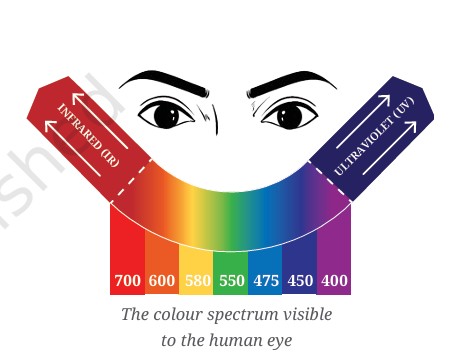
The visible colour spectrum is the range of colours of light that the human eye can detect. When white light passes through a prism, it separates into different colours because each colour has a different wavelength. This beautiful band of colours is called the visible spectrum.
The seven commonly named colours of the spectrum are:
Red → Orange → Yellow → Green → Blue → Indigo → Violet
These colours are often remembered using the acronym VIBGYOR, which lists them in reverse order.
- Red – has the longest wavelength.
- Orange
- Yellow
- Green
- Blue
- Indigo
- Violet – has the shortest wavelength.
Although we commonly identify seven colours, the visible spectrum is actually a continuous range of colours. There are many shades and gradual transitions between one colour and another.
Artists observe and use this wide range of colours to create contrast, harmony, depth, mood, balance, and visual interest in their artworks. The colours found in sunlight, rainbows, flowers, landscapes, and everyday objects provide endless inspiration for visual expression.
Thus, the colour spectrum helps us understand the beautiful relationship between light, colour, nature, and human vision, while providing artists with a rich palette for creative expression.
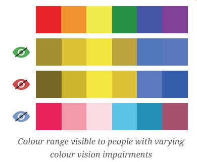
COLOUR RANGE VISIBLE TO PEOPLE WITH VARYING COLOUR VISION IMPAIRMENTS
People do not always perceive colours in exactly the same way. Colour vision impairment is a condition in which some colours are difficult to distinguish from one another. It does not usually mean that a person sees the world only in black and white. Instead, certain colours may appear similar, less bright, or different from how other people perceive them.
The most common types of colour vision impairment include red–green colour vision deficiency, blue–yellow colour vision deficiency, and, rarely, complete colour vision deficiency.
People with red–green colour vision deficiency may have difficulty distinguishing between certain shades of red, green, brown, and orange. People with blue–yellow colour vision deficiency may find it difficult to distinguish between some blue and green shades or between yellow and pink. In complete colour vision deficiency, colours are greatly reduced or may not be perceived at all, and the world may appear mainly in shades of grey.
Colour vision can therefore affect how people experience paintings, drawings, symbols, maps, charts, and other visual artworks. Artists and designers can make their work more accessible by using differences in lightness, patterns, shapes, textures, outlines, and labels, rather than depending only on colour to communicate information.
Understanding different ways of seeing colour helps us appreciate that visual experiences can vary from person to person. It also encourages artists to create inclusive artworks that can be enjoyed and understood by a wider range of viewers.
ACTIVITY 16.1: EXTEND THE COLOUR WHEEL
Colour is one of the most important elements of visual art. It can make an artwork bright and lively, calm and peaceful, dramatic and powerful, or warm and welcoming. Artists use colours not only to make their work attractive but also to express ideas, feelings, moods, relationships, and visual experiences. To understand how colours work together, artists use a useful tool called the colour wheel.
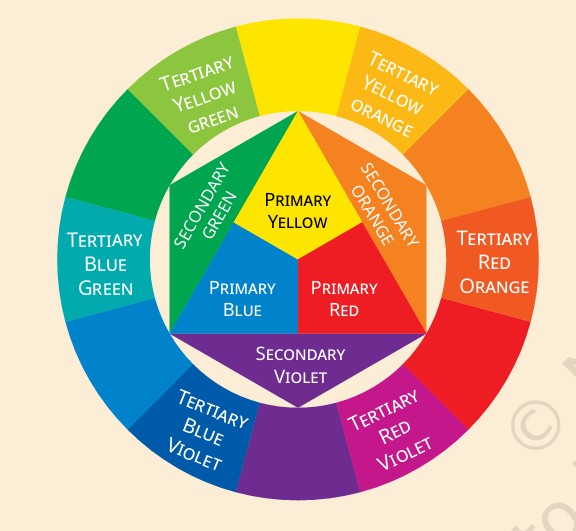
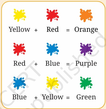
The colour wheel helps us see the relationship between different colours and understand how new colours can be created by mixing existing ones. At its centre or starting point are the primary colours—yellow, red, and blue. These colours are traditionally treated as colours that cannot be created by mixing the other colours in the artist’s colour system. When two primary colours are mixed, they produce secondary colours. For example, yellow and red produce orange, yellow and blue produce green, and red and blue produce violet.
But the exploration of colour does not end with primary and secondary colours. The colour wheel can be extended further by creating tertiary colours. These colours are made by mixing a primary colour with a neighbouring secondary colour. For example, mixing yellow with green creates yellow-green, while mixing blue with green creates blue-green. Similarly, yellow-orange, red-orange, red-violet, and blue-violet can be created from the other secondary colours.
Extending the colour wheel allows us to discover a much wider range of colours and understand how colours gradually change from one hue to another. It also helps artists choose colours for contrast, harmony, balance, emphasis, and visual interest. Colours that are close to one another on the wheel can create a harmonious effect, while colours placed opposite each other can create strong contrast.
This activity encourages us to observe, experiment, mix, compare, and create. By making our own extended colour wheel, we can understand colour relationships more clearly and develop greater confidence in using colour in paintings, drawings, designs, crafts, and other visual artworks.
The colour wheel is therefore more than a circle of colours. It is a creative guide that helps artists explore the endless possibilities of colour.
1. Look at the colour wheel here. In the centre, you find three primary colours — yellow, red and blue. These cannot be made by mixing any other colours.
2. Mixing each pair of primary colours produces a secondary colour.
3. Now, you will learn to make tertiary colours. These are formed by mixing any secondary colour with one of its primary colours. For example, green is a secondary colour that is made by mixing yellow and blue (primary colours).
The tertiary colours made from green are:
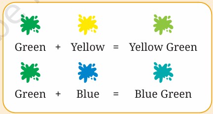
MAKE A COLOUR WHEEL
Materials: Watercolours or poster colours are more suitable for this activity. However, you can also experiment with other dry mediums like crayons, colour pencil, colour powder, etc.
Step 1: Design your colour wheel to clearly demarcate the primary, secondary and tertiary colours.
Step 2: Mix your colours using only red, blue and yellow to make all the other colours. This is the most important step.
Step 3: Look at the image on the previous page for reference. Paint the colours in appropriate sections. Use a variety of strokes, patches, dots or any other pattern you like.
Step 4: Display your complete colour wheel and keep it handy for other activities, you will be doing soon.
ACTIVITY 16.2: MAKE COLOUR TONES
Colour tones help artists create depth, softness, contrast, and mood in an artwork. By changing the intensity or lightness of a colour, we can produce many different variations from a single hue. This allows artists to move beyond basic colours and create a richer and more expressive palette.
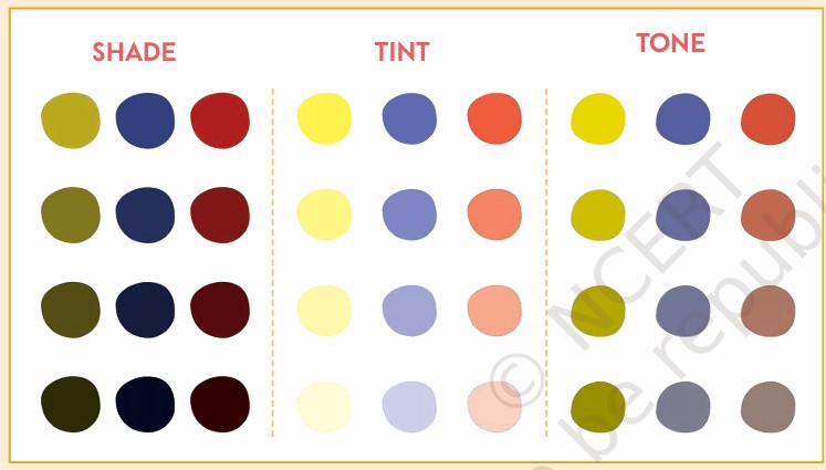
A colour can be modified by adding white, black, grey, or another colour. When white is added, the colour becomes lighter and produces a tint. When black is added, the colour becomes darker and produces a shade. When grey is added, the intensity of the colour is reduced, creating a tone.
You have learnt to create light and shade using cross-hatching and stippling. Let us practise creating light and shade with colour.
TECHNICAL TIP
While using paints, it is important to change the water in your bowl and rinse your brush well, after mixing each colour. This will help you get the right tints, shades and tones you want.
MAKE TINTS AND SHADES OF ANY TWO COLOURS
- Create at least four gradations of tints and shades.
- Begin by mixing small quantities of black or white to the colour.
- Increase the quantity of black or white for each gradation
MAKE TONES OF THE CHOSEN TWO COLOURS
Tones are produced by mixing a colour with grey. But how do you make grey?
- Mix black and white to make grey.
- Mix this grey with other colours to make their tones.
- Try to get four tonal gradations.
ACTIVITY 16.3: PLANT STUDY IN COLOUR
Plants change form and colour as they grow through different seasons. Fruits and vegetables are often green when they are raw and change colours as they ripen. Let us create artistic studies of plants to understand colours better.
STUDY A PLANT THROUGH DRAWING
Step 1: Select a stem with a few leaves or a single flower (in any stage of its life).
Step 2: Place it in front of you and do not disturb its position.
Step 3: Sit at least two feet away and observe its shapes and the space around it.
Step 4: Using light lines, make quick drawings from two different angles.
Step 5: Next, choose one of the angles that you tried and start another drawing.
Step 6: Cover the maximum space on your paper and draw slowly to capture the details.
Step 7: Complete the drawing and keep it ready to start colouring.
ADD COLOUR TO YOUR PLANT STUDY
Step 1: Choose any medium for colouring such as crayons, colour pencils, pastels, watercolour and poster colour.
Step 2: Observe the colours on the plant and find the right shades, tints or tones from the colour wheel.
Step 3: Mix the required colours, and show light, shade and shadows in your artwork.
Step 4: Complete your artwork and have a class display.
SELF-ASSESSMENT
1. How many sketches did you make?
2. What were you able to do well?
3. Write about the challenges you faced and the improvements you would like to see in
your work.
DO YOU KNOW?
This botanical illustration is from a book called Hortus Malabaricus. It means ‘Garden of Malabar’. This book has recorded thousands of medicinal plants found in the Malabar coast of India during the 17th century.
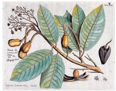
Hortus Malabaricus is therefore significant not only as a botanical record but also as an example of the connection between nature, knowledge, art, and documentation. Its illustrations help us appreciate how visual art can preserve information about the natural world and make scientific knowledge easier to study and understand.
COLOURS IN MINIATURE PAINTINGS
Miniature painting is a distinctive tradition of Indian painting known for its delicate details, fine lines, carefully balanced compositions, and rich colours. These paintings were created on small surfaces such as paper, cloth, and manuscripts, requiring artists to work with great patience and precision. Colour played an important role in making these paintings expressive and visually appealing.
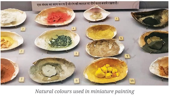
Traditionally, miniature painters used natural pigments obtained from minerals, plants, flowers, earth, and other sources. Colours were carefully prepared, mixed, and applied in thin layers. Some pigments were highly valued because they produced bright and long-lasting colours. Artists also used colours according to the subject, region, style, and purpose of the painting.
Different colours could convey particular moods, qualities, and meanings. Bright red and orange could suggest energy, passion, celebration, or royalty. Yellow was often associated with brightness, auspiciousness, or spiritual qualities. Green could represent nature, freshness, and fertility, while blue was frequently used for skies, water, and particular divine figures. White could suggest purity and peace, whereas black and darker shades could provide depth and strong contrast.
Miniature paintings often use flat areas of colour along with fine details and decorative patterns. Artists carefully balanced colours so that figures, clothing, architecture, landscapes, and ornaments remained clearly visible. Gold and other decorative colours were sometimes used to highlight jewellery, costumes, borders, weapons, and architectural details.
Different miniature traditions developed their own distinctive colour palettes. Rajasthani, Pahari, Mughal, and Deccani miniature paintings, for example, display differences in colour choices, themes, techniques, and artistic influences. The colours help create the atmosphere of royal courts, gardens, forests, seasons, festivals, and stories from literature and mythology.
Studying colours in miniature paintings helps us understand that colour is not merely decorative. It can communicate emotion, identity, symbolism, atmosphere, and cultural ideas. Through careful observation and skilled use of colour, miniature artists transformed small surfaces into richly detailed worlds of visual storytelling.
You might be aware that paintings can be made on a variety of surfaces such as rocks, walls, clay, palm leaf, paper, fabric, wood, metal, glass, rubber and other synthetic plastics that are available today.
Natural colours and pigments for artwork are sourced from soil, minerals and plants, that are extracted in many ways. Colours fade and disappear over time if they are exposed to excessive light, moisture and touch of various living organisms.
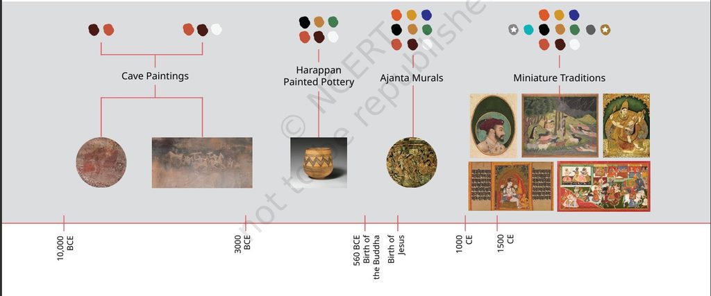
This timeline shows important phases in Indian painting and the evolution of colour over time.
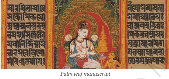
Palm leaf manuscript
A palm leaf manuscript is a traditional form of writing and visual art created on carefully prepared palm leaves. Before paper became widely available, palm leaves were used to preserve important knowledge and literary works. The leaves were cleaned, dried, polished, and cut into suitable shapes and sizes.
Texts were often engraved with a stylus on the surface of the leaf. Natural pigments could be applied to make the letters and illustrations more visible. Some manuscripts were decorated with drawings, borders, floral patterns, and symbolic figures.
Palm leaf manuscripts preserved religious teachings, literature, philosophy, medicine, astronomy, mathematics, and traditional knowledge. Their illustrations often used fine lines, simple forms, and carefully selected colours.
These manuscripts are important examples of India’s artistic and cultural heritage. They show how writing, illustration, design, and knowledge were brought together in a single work. Today, many surviving manuscripts are carefully preserved in museums, libraries, temples, and other cultural institutions.
Miniature paintings are of many styles and are generally small in size. In India, these were initially done on palm leaves. From the 12th century CE, artists began to use paper as the base for miniature paintings. Their themes included religious texts, mythology, nature, portraiture and court life.
MUGHAL MINIATURE PAINTING
Mughal miniature painting is a famous tradition of Indian painting that developed during the Mughal period. It is known for its fine lines, delicate details, rich colours, and carefully arranged compositions. These small paintings were often created to decorate manuscripts, royal books, and albums.
Mughal artists were inspired by Persian, Indian, and Central Asian artistic traditions. They painted subjects such as royal courts, rulers, battles, hunting scenes, gardens, animals, birds, flowers, and important events. Portrait painting became especially important, with artists carefully showing the features, clothing, jewellery, and personalities of their subjects.
The colours used in Mughal miniatures were often bright, refined, and carefully balanced. Artists used natural pigments and sometimes applied gold to add richness and decorative beauty.
Mughal miniature painting reflects the artistic skill, cultural diversity, and historical life of its period. Its detailed figures, beautiful colours, and storytelling qualities make it an important part of India’s visual art heritage.
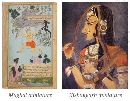
KISHANGARH MINIATURE PAINTING
Kishangarh miniature painting is an important style of Rajasthani miniature painting that flourished in the eighteenth century in the princely state of Kishangarh. It is especially known for its graceful figures, elegant compositions, delicate lines, and soft, harmonious colours.
The style became famous during the reign of Maharaja Sawant Singh, who was also a poet and admirer of Krishna devotion. The artist Nihal Chand played an important role in developing the distinctive Kishangarh style. Many paintings show Krishna and Radha, along with scenes of love, devotion, gardens, lakes, and beautiful landscapes.
One of the most recognisable features of Kishangarh paintings is the idealised female figure known as Bani Thani, shown with an elongated face, arched eyebrows, lotus-like eyes, a graceful nose, and elegant posture. The paintings often use delicate shades of green, blue, pink, yellow, and white.
Kishangarh miniatures beautifully combine devotion, poetry, nature, and artistic imagination, making them an important part of India’s rich miniature painting tradition.
DO YOU KNOW?
The word ‘miniature’ originates from ‘minium’, a red-coloured pigment that was used to draw outlines and write text in medieval manuscripts.
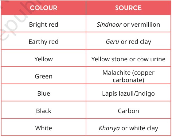
The table below tells you about the source of some of the colours used in miniatures. These were processed and mixed with gum extracted from the Babul tree to act as a binder.
DO YOU KNOW?
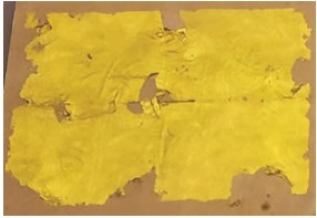
Gold and silver were also used in miniature paintings. Gold and silver are hammered into very thin sheets known as gold leaf and silver leaf. These are used in paintings and other crafts.
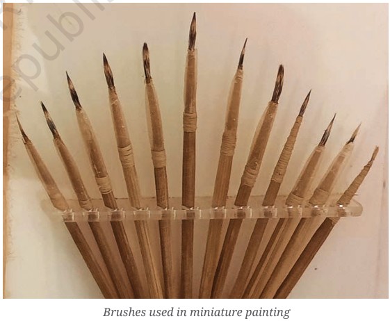
They used brushes made of soft hair from the fur or hair of animals such as camels, goats, cows, and hair from the tails of rats, squirrels and mongoose.
Care for Art Materials and Tools
It is important to take care of the space we work in, as well as the materials and tools we use for artwork.
- Always clean your brushes, palettes and other tools thoroughly with soap after every use.
- Close paint tubes, bottles, sketch pens and markers with their caps, to prevent colour from drying.
- Store all materials in an organised way so that they can be easily found and used by others too.
ACTIVITY 16.4: DECODE THE PALETTE OF A MINIATURE
Miniature paintings are known for their rich colours, fine details, delicate lines, and carefully planned compositions. Colour is not used only to make these paintings beautiful; it also helps communicate the mood, setting, characters, emotions, and meaning of the scene. By studying the colours used in a miniature painting, we can learn more about the artist’s choices and the story being represented.
Artists traditionally prepared colours from natural materials such as minerals, plants, flowers, earth, and other substances. Different regions and painting traditions developed distinctive colour palettes. Bright reds, yellows, blues, greens, and oranges were often used alongside softer shades to create contrast and harmony. Gold was sometimes added to costumes, jewellery, borders, and decorative details.
When we decode the palette of a miniature, we carefully observe which colours appear most often and where they are placed. We can ask questions such as: Which colour dominates the painting? Which colours are used for clothing, landscapes, architecture, and objects? Are the colours bright or muted? Which colours create contrast? How do the colours affect the mood of the scene?
For example, green may be used extensively for gardens and landscapes, while blue may represent the sky or water. Red and orange can draw attention to important figures or objects, while white can create highlights and a sense of clarity.
Studying the palette helps us understand that colour is a visual language. It guides our eyes, creates atmosphere, highlights important elements, and adds meaning to the artwork. By decoding the palette, we learn to look at miniature paintings more carefully and appreciate the skill, imagination, and cultural knowledge of the artists who created them.
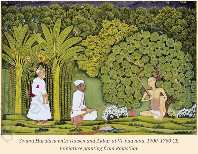
Observe this Rajasthani miniature painting from the 18th century. The three people you see in the lush green landscape are the musician Tansen, his guru Swami Haridas and the Mughal emperor Akbar.
Discuss the points given below.
1. What is happening in this painting?
2. Can you guess the time and season?
3. What moods or feelings do you experience?
4. Analyse different shades of green you see here using the colour wheel.
5. Where is the biggest tree placed? Why do you think the artist did that?
6. Observe the patterns on the leaves and the fine lines of the clouds. What other details do you
see in the painting?
Write a short paragraph on all that you have learnt about miniatures.
Swami Haridasa with Tansen and Akbar at Vrindavana
Swami Haridasa with Tansen and Akbar at Vrindavana, dated 1700–1760 CE, is a Rajasthani miniature painting. The scene brings together three important figures associated with music and the Mughal period—Swami Haridasa, the renowned musician and spiritual teacher; Tansen, one of the celebrated musicians of Akbar’s court; and Emperor Akbar.
The painting is especially useful for studying the palette of miniature painting. The lush green landscape creates a natural and peaceful setting, while the colours of the figures’ clothing, objects, and surroundings provide contrast and visual interest. The careful arrangement of figures, vegetation, and architectural or natural elements demonstrates the artist’s attention to detail, balance, colour, and storytelling.
It also shows how miniature paintings can combine history, music, spirituality, nature, and visual expression within a small space.
CONCLUSION
Nature’s palette is much more than a collection of beautiful colours. It is a rich source of ideas, forms, patterns, textures, rhythms, and emotions that inspire artists. By observing nature closely, we learn to recognise subtle colour variations and understand how light, seasons, and surroundings influence what we see.
Using colours inspired by nature allows artists to represent the world realistically or transform it through imagination and creativity. Natural forms such as flowers, leaves, trees, birds, animals, and landscapes can be simplified, stylised, or combined to create new artistic designs.
The study of nature’s palette also develops observation, imagination, sensitivity, and appreciation for the environment. It reminds us that the natural world itself is a wonderful work of art and that every season and landscape offers something new to discover.
Thus, Nature’s Palette of Visual Arts encourages us to observe, explore, and create while developing a deeper connection with the colours and beauty of the world around us.