
INTRODUCTION
Calligraphy is the art of beautiful and expressive handwriting. It involves arranging letters, words, and symbols in an artistic way using different styles of writing, tools, and techniques. Calligraphy is not simply about writing neatly; it combines line, shape, spacing, rhythm, and creativity to make written words visually attractive.
Calligraphy has been practised in many cultures around the world. Different writing traditions have developed their own distinctive scripts, forms, and artistic styles. In India, beautiful calligraphic traditions can be seen in manuscripts, inscriptions, religious texts, poetry, official documents, and decorative artworks.
Calligraphers use tools such as pens, brushes, reed pens, ink, and handmade writing instruments. The thickness and direction of a stroke can change the appearance and character of a letter. Careful spacing and repeated practice help create balanced and harmonious compositions.
Today, calligraphy can be created using both traditional and modern tools. Artists may experiment with different papers, inks, colours, lettering styles, and digital techniques.
Learning calligraphy develops patience, concentration, hand control, observation, and creativity. It also helps us appreciate the beauty of written language and understand how writing itself can become a form of visual art.
SCRIPTS AND INDIAN CALLIGRAPHY
Scripts have the power to record people’s languages, ideas, and expressions. They help preserve knowledge and cultural traditions and pass them from one generation to another.
India has a long history of writing systems. The story of Indian scripts can be traced back to the 5,000-year-old Indus-Sarasvati civilisation. However, the script used by this civilisation has not yet been conclusively deciphered. One of the earliest widely decoded Indian scripts is Brahmi, which was used in the Ashokan edicts nearly 2,300 years ago.
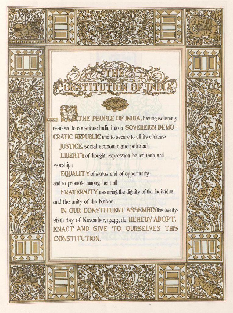
The original Constitution of India is a remarkable example of handwritten calligraphy. It was beautifully written by two expert calligraphers. Prem Behari Narain Raizada handwritten the English version, while Vasant Krishan Vaidya wrote the Hindi version. The Constitution was signed on 24 January 1950 and came into effect on 26 January 1950, which we celebrate as Republic Day.
Today, the Constitution of India officially recognises 22 languages in its Eighth Schedule. India has a rich variety of scripts, each with its own distinctive shapes, curves, lines, and visual beauty.
Who is Prem Behri narain Raizada ?
Prem Behari Narain Raizada (1901–1966) was a skilled Indian calligrapher best known for beautifully handwriting the original English version of the Constitution of India.
Raizada wrote the Constitution by hand in an elegant calligraphic style using a flowing italic script. He worked carefully to maintain consistency, spacing, and clarity across the entire document. His contribution is remembered as an important part of the artistic presentation of India’s Constitution.
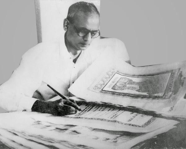
The original Constitution was not simply a legal document; it was also designed as a work of art. Its pages were decorated with illustrations inspired by India’s history and cultural heritage, while the text was handwritten by expert calligraphers.
Raizada’s work demonstrates the importance of patience, precision, discipline, and artistic skill in calligraphy. His handwriting helped give the original Constitution its distinctive and timeless appearance.
Today, the handwritten Constitution is preserved as an important national heritage document, reminding us of the craftsmanship and dedication involved in creating it.
You will learn and discover more about calligraphy in this chapter.
Letters and the Evolution of Writing
Letters are the smallest units of a script. When we see an unfamiliar script, it may look like a collection of small drawings or symbols. However, many writing systems developed gradually over a long period of time.
In the early stages of human communication, people used drawings and pictures to represent objects, ideas, and events. These simple pictures gradually developed into pictograms, in which a picture represented a particular object or meaning. Over time, these symbols became more organised and began to represent sounds, words, and ideas.
Through continuous changes and improvements, pictograms evolved into more systematic forms of writing. The letters and symbols we use today are therefore the result of a long journey of human creativity and communication.
The evolution of writing shows how people transformed simple drawings into organised systems that could record languages, knowledge, stories, and cultural traditions. Calligraphy further adds artistic beauty to these written forms by exploring the shapes, lines, spacing, and arrangement of letters.
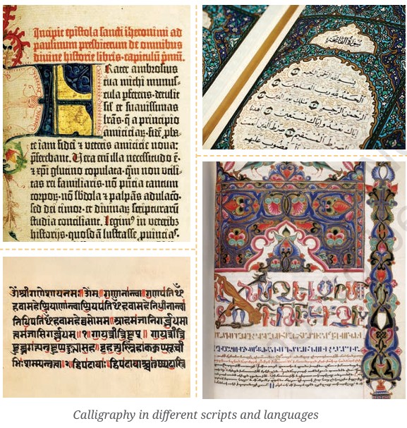
Calligraphy in Different Scripts and Languages
Calligraphy is practised in many parts of the world and takes different forms according to the script and language being written. Each script has its own shapes, lines, curves, and patterns, giving calligraphy a unique visual character.
In India, calligraphy can be seen in scripts such as Devanagari, Bengali, Gurmukhi, Gujarati, Tamil, Telugu, Kannada, Malayalam, and Urdu. Artists use different pens, brushes, inks, and techniques to bring out the beauty of each script. Devanagari is recognised by its horizontal headline, while many South Indian scripts have rounded forms. Urdu calligraphy, particularly Nastaliq, is known for its flowing and elegant appearance.
Around the world, different traditions have also developed distinctive styles of calligraphy. Arabic calligraphy is famous for its graceful curves and flowing strokes. Chinese calligraphy uses brushes to create expressive variations in line thickness and movement. Japanese calligraphy, known as Shodō, emphasises brush control, rhythm, and balance. Korean calligraphy and Western Latin calligraphy also have their own characteristic styles.
Although these scripts look different, calligraphy in every tradition combines writing and visual art. It shows how language can be expressed not only through meaning but also through beautiful shapes, rhythm, movement, and design.
Calligraphy: More Than Beautiful Writing
Calligraphy is much more than simply writing letters to form words. It is an artistic expression in which artists use the shape, size, movement, and arrangement of letters to communicate emotions and create different visual effects. Every stroke is made with care, patience, and practice.
Calligraphers spend considerable time and effort writing, inscribing, and carving letters by hand. Different styles of letters are created for different purposes. In ancient manuscripts, letters were often highly decorative, flowing gracefully across the page and adding beauty to the written text. Sometimes, letters were arranged creatively to form the shape of a frame, object, or picture, making the writing itself part of the artwork.
The style of lettering also depends on its purpose. For example, newspapers use bold, clear, and easily readable letters to attract attention and help readers understand information quickly. In contrast, decorative calligraphy may focus more on beauty, rhythm, and artistic expression.
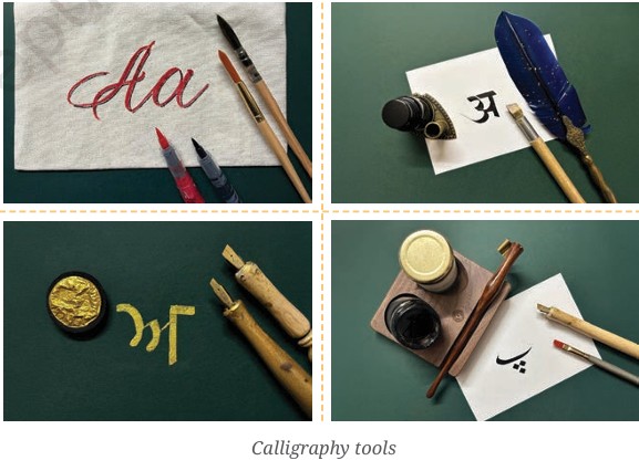
Calligraphy can be created using a variety of tools and materials, including quills, brushes, nibs, inks, and paints. Artists may write or decorate surfaces such as palm leaves, cloth, paper, wood, and other materials. Thus, calligraphy beautifully brings together language, craftsmanship, creativity, and visual art.
ACTIVITY 19.1: LOOKING AT LETTERS
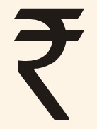
Which letters can you find in the Indian Rupee symbol?
Letter Play: Symbols, Shapes and Ideas
Letters and symbols can be creatively designed to communicate ideas and create a strong visual identity. A good example is the Indian Rupee symbol (₹). Its design is inspired by the Devanagari letter र and the Latin capital letter R. The horizontal lines in the symbol are connected to the Shiro-Rekha, or headline, seen in Devanagari writing. The design also creates a visual connection with the horizontal bands of the Indian national flag.
This shows how a familiar letter can be transformed into a meaningful symbol. By experimenting with the lines, curves, shapes, size, and arrangement of letters, artists and designers can make written language more expressive.
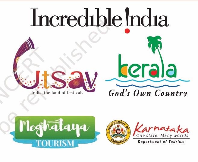
Look at the ‘Incredible India’ logo. The creative use of the exclamation mark as part of the lettering makes the design visually interesting and expressive. Such letter play can attract attention, communicate an idea, and make a logo easier to remember.
Now observe other logos around you. Look carefully at how letters have been changed, joined, enlarged, rotated, repeated, or combined with images and symbols.
ACTIVITY 19.2: LETTER HUNT
Exploring Printing Before Digital Technology
Before the invention of digital technology, printing was a long and careful process. Text and images had to be prepared by hand or arranged using physical letters, blocks, or printing plates. These methods required considerable time, skill, and effort.
In traditional printing, letters and images were first prepared and arranged in the correct order. Ink was then applied to the printing surface and transferred onto paper or another material. Printers had to check the alignment, spacing, ink, and quality of each page carefully. Large numbers of copies could then be produced using printing presses.
Newspapers also involved several stages of preparation before they reached readers. Today, computers and digital printing have made many of these processes faster and more efficient.
Activity:
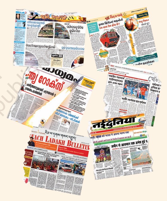
Visit a newspaper office, printing press, or print studio with your teacher or an adult. Observe how text and images are prepared, printed, and arranged. Find out how the process was carried out before digital technology and compare it with the methods used today.
Let us begin a treasure hunt activity using print material found in our surroundings.
Step 1: Collect a few newspapers, and printed material including invitation cards, food packaging material and old magazines.
Step 2: Discuss and write your thoughts about —
- How are the words or letters arranged?
- Why do you think the letters are printed in different colours and sizes?
- What do you find attractive in the style of letters or words?
- Which words on the printed material are most important? Why?
Step 3: Cut out words and letters of different sizes and styles.
Step 4: Work in groups to find similar letter styles. For example, decorative, bold, italic, thin, narrow, etc.
Step 5: Arrange and paste them on an A3-size paper by grouping similar letter styles.
ACTIVITY 19.3: SIMILAR BUT DIFFERENT
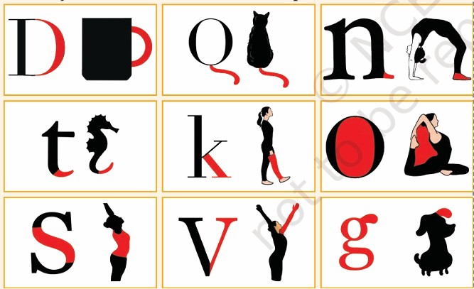
Observe the table below. It shows different versions of the same letter.

Are you able to read the same letter written in so many ways?
This is similar to human or animal bodies. We have the same body parts, yet we look unique. Human anatomy is about the number of bones, muscles, joints, etc. Similarly, the anatomy of letters reveals the different parts of a letter.
Step 1: Choose a letter from any script you are familiar with.
Step 2: Take a sheet of paper and write the letter you have chosen in different ways.
Step 3: Start by writing letters freely. Use your non-dominant hand, and see the lines and shapes that are formed. Use different kinds of pens, pencils and other writing tools. Make the letters big and small.
Step 4: Take another sheet of paper. To structure the same letter, mark a baseline, top line and a middle line.
Step 5: Mark vertical lines to create a grid. This will help you estimate the width of each alphabet, as well as the space between each letter.
Step 6: Create five variations of the same letter. Use the guidelines to alter the height, width, angles and line-thickness of the letters to achieve different styles. Begin writing the letter, keeping in mind its anatomy.
Step 7: Share your work with your peers. Discuss how you wrote one letter in different ways.
ACTIVITY 19.4: WRITING LIKE WE SPEAK
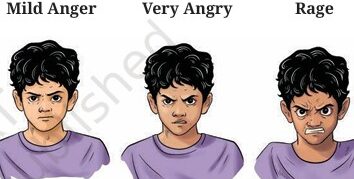
When we speak, we change our voice, volume, pitch, and tone to express different feelings. These changes help others understand what we are trying to say. For example, when we wish our friend “Happy Birthday!”, we may speak with excitement and joy. On the other hand, when we say “Get well soon,” we usually speak in a soft and calm voice to show care and concern.
We can create similar expressions through writing and lettering. The way letters look can change the feeling of a word. Large, bold, and thick letters can suggest a loud or powerful voice. Small, thin, and softly curved letters can suggest a quiet or gentle voice. The size, shape, thickness, direction, spacing, and arrangement of letters can all be used creatively.
For example, letters placed close together may create a feeling of tension, while widely spaced letters may suggest calmness or openness. Curved and flowing letters can give a sense of movement or happiness, while sharp or uneven letters can suggest anger, fear, or excitement.
Activity: Create Your Own Lettering
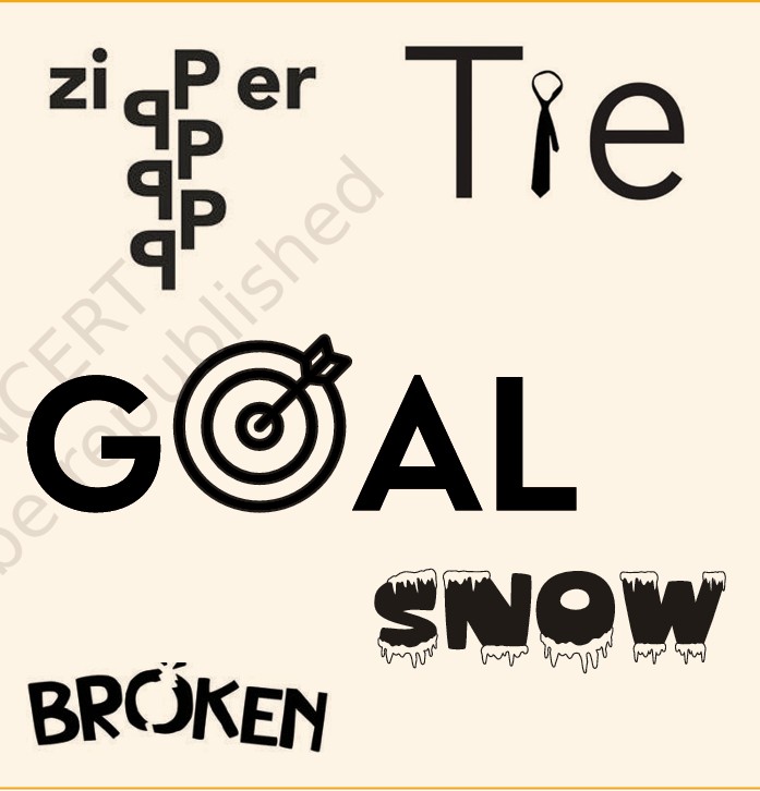
Now, experiment with letters and create different visual expressions. Choose words that show emotions such as joy, anger, fear, surprise, love, or peace. Try writing each word in different sizes, shapes, and styles.
Look at the examples given alongside this activity and observe how the letters communicate emotions. Then create your own designs using a language or script you are comfortable with.
Finally, share your designs with your classmates and discuss how the lettering changes the meaning or feeling of each word.
ACTIVITY 19.5: CALLIGRAPHY IN POSTERS
All In A Name
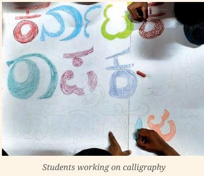
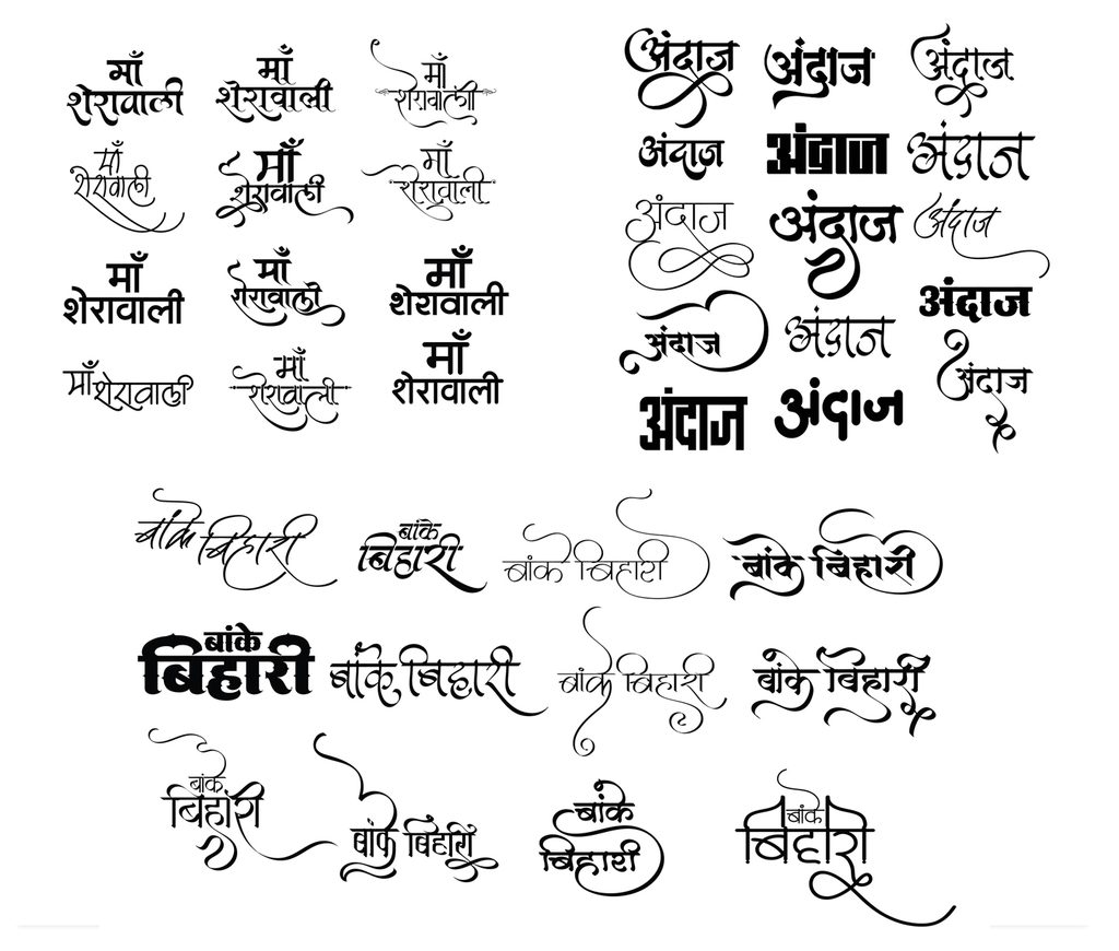
A lot of thought goes into choosing a name for a newborn child. In the same way, great care is taken when choosing titles for books, plays, films, and awareness campaigns. A good title gives people an idea about what to expect and helps them remember the event or work.
The style, size, shape, and arrangement of letters are important in posters and other promotional materials. The way words are designed can attract attention and communicate the mood of an event. For example, large and bold letters may suggest excitement, while soft and flowing letters may suggest a calm or joyful event. Dark, sharp, or unusual lettering may create a feeling of mystery or suspense.
Think about the different posters you have seen around you. Observe the information they provide and how the text is arranged. Notice the title, date, time, venue, important details, images, and other information. Discuss how the size and placement of text help the viewer understand the poster quickly.
Activity: Make Your Own Poster
Use your calligraphy skills to create a poster for a play, school function, exhibition, competition, or any other school event.
Step 1: Choose a Title
Think of a suitable and interesting name for your play or event. Make sure the title matches its theme.
Step 2: Design the Title
Choose the letter style, size, and colours for your title. Think about how your lettering can show the mood of the event. A playful style can suggest happiness, while bold or sharp lettering can suggest excitement or suspense.
Step 3: Plan the Layout
Before writing, mark the guidelines and margins. Arrange the title and other information neatly so that the poster is attractive and easy to read.
Use creativity, careful lettering, and good spacing to make your poster both informative and visually appealing.
Information in a poster
After finalising the letter style of the title, proceed to write other information on the poster like:
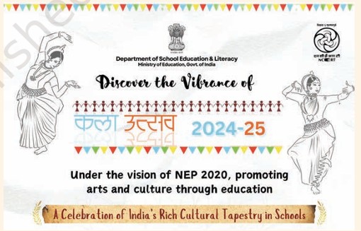
1. Date, time and venue;
2. Contact information, and
3. Names of people, organisations, institutions, performing troupes, etc.
For these, your letter styles should be clear and easily readable. Choose suitable sizes to indicate their importance and use guidelines while writing.
Add visuals and complete your poster for display
Conclusion
Calligraphy is an art form that connects language, writing, and visual expression. From early pictorial symbols to the scripts used today, written forms have developed as a way to record and communicate ideas, knowledge, and culture. Calligraphy adds an artistic dimension to writing through the careful use of lines, shapes, strokes, spacing, and composition.
Different scripts and languages have their own visual characteristics, and calligraphers use a variety of tools and materials to express them. Letters can also be creatively shaped and arranged to communicate emotions, create symbols, design logos, and attract attention in posters and other forms of communication.
By exploring calligraphy, we learn to observe letters carefully and understand how their visual qualities can influence the way a message is received. Regular practice also helps develop patience, precision, concentration, creativity, and hand control. Calligraphy therefore reminds us that writing is not only a means of recording words but can also become a meaningful and expressive form of art.